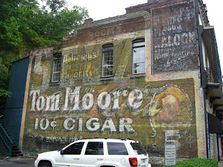
Location: Corner of Scott & Second Street, Little Rock
"When asked how he managed to be happy every day, Mr. Adair would simply say, 'I trick my mind into thinking I'm having fun.' This attitude adjustment always applied, even to those times when he found himself hoisted high above ground in 100-degree heat."
The above quote is from Bob Adair, a lifelong painter of wall signs. I read the interview in Ghost Signs of Arkansas after Jenna surprised me with it one night (she had planned on presenting it to me after the wedding, but I talked about buying it too much, so I got it sooner. Yay, persistence!). These painters were commonly known as "Wall Dogs," and this particular dog began his career in 1924, ending it sometime in the 90s.

Location: Sheridan
The wall dog's job was one of precision. Folks like Adair would often travel in pairs, with one dog laying down a framework in charcoal, and the second filling out the skeleton with colored paints. The above sign was in a particularly bizarre location, lurking in a back alley home now only to bits of broken glass and plastic lawn chairs. I spotted it from far away and hiked over the cracked concrete to get to it. Later, I felt like I needed some ice cold refreshment. Looks like those ads still work this many years later...

Location: Batesville
Speaking of refreshment, this sign in downtown Batesville was totally restored by some modern wall dogs in 1988 at the behest of the city. The 20 years since then have worn it down, letting some of the layers underneath peek through. If you squint, you can make out the phrase "Relieves Headaches" at the upper right. This is hilarious, but I'll remind you that extra-strength Excedrin actually contains caffeine as one of its active ingredients. Unfortunately Coke is still just about as inept at curing migraines as it is curing thirst. That didn't stop me from drinking some on the afternoon I snapped that picture, though.

Location: Hot Springs
The thing I love the most about these signs is that they are never tacky. I'm sure someone out there might argue with me over that, but I haven't seen a tacky one yet. The text is perfectly aligned, it's clear and legible, beautiful, classy and artistic. There's no papyrus or comic sans or monotype corsiva. And when the text isn't perfectly aligned, it's endearing instead of annoying. The artists were skilled.
"One such skill, according Mr. White [another wall dog], is the ability to judge scale and proportion well enough to start at any point in the lettering or graphic and paint the sign to fit the space. To prove himself to a skeptical client, he once had to paint lettering for the word 'Solarcaine' backwards, from right to left, on a large billboard."

Location: Hot Springs
As a last image in today's entry, here's one of my all-time favorite signs. This one has just about everything on it, from giant 3-d letters to Coca-Cola to outdated prices to long-gone businesses. The box in the upper right advertises a "saloon," which is worth an entire time machine in itself. The phantom of the word "rooms" haunts the very top of the display, bringing me to muse on what kind of folk populated the rooms in the first half of the 20th century. And looming behind the whole picture is the colossal, cryptic "SELZ," that could really be just about anything.
Next, we'll travel outside of Arkansas to see what ghosts other states might offer.
-Jonesy

2 comments:
You should check out this video of guys doing it today. There's a book dedicated to Arkansas signs and over here in the UK we're working on an archive.
Wonderful! I do actually own the Arkansas book and have some quotes from it in this post. Thanks for reading!
Post a Comment